


 26-10-2026
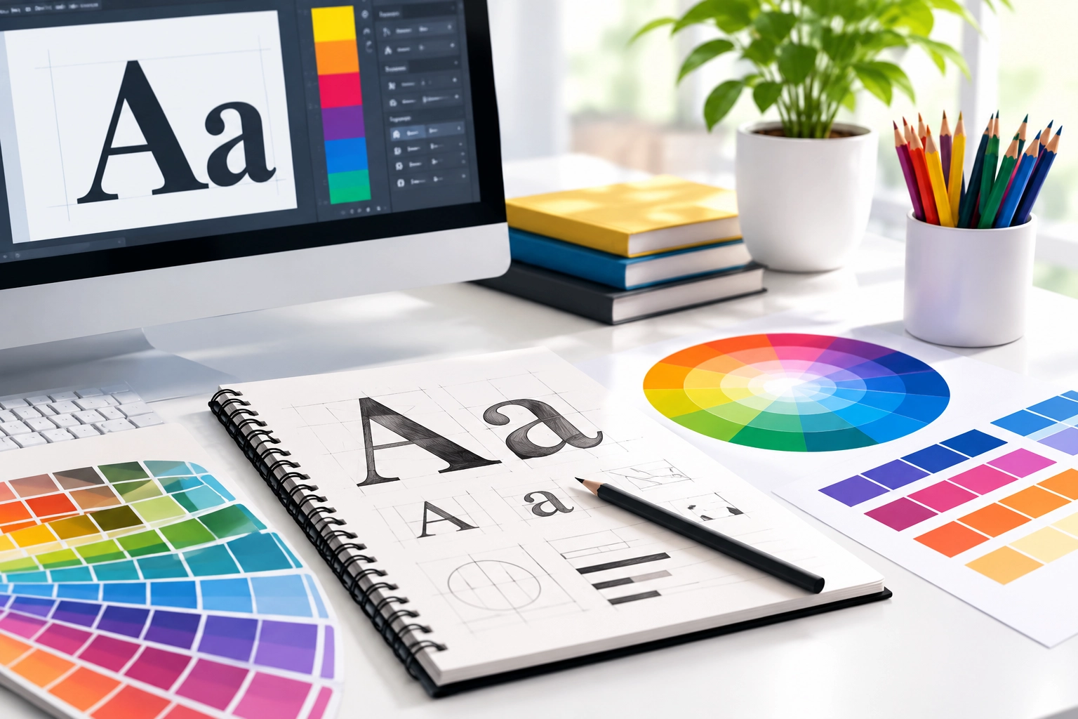
Services provided by the Best Graphic Design Company help the companies to create attractive designs that can convey the intended message. Typography and color theory make up an important foundation for the new Graphic Design. These two things affect the manner in which the visuals are read and perceived. Selection of the correct font and color is very important while creating any kind of content, including social media pages, banners, brochures and business logos.
Understanding Typography in Graphic Design
Typography is a procedure of designing the text which can be readable, good to see, and understandable. This includes selection of typefaces, spaces, and size of the text in order to design the hierarchy of the text. Typography guides the reader from the heading of the text to the text itself.
The following are the basic rules of typography for beginners:
- Fonts: Choose the fonts that suit the brand’s personality as well as its design intentions.
- Fonts Combination:Use two fonts such as bold fonts for heading and regular fonts for body texts.
- Text Hierarchy: Use various sizes of fonts and make differences between them so that you may emphasize your heading, subheadings, etc.
- Spacing and Alignment: Make the spacing of letters, lines, and paragraphs consistent.
Following these rules can lead to creating balanced designs.
Exploring Color Theory for Better Designs
Color theory describes how colors work together and how they can be combined to make things look aesthetically pleasing. Colors can also represent emotions, create a brand image, and capture people’s attention. Blue symbolizes trust, green represents growth, and red represents energy.
These color theory methods can be applied by beginners as follows:
- Color Wheel: Learn about how primary, secondary, and tertiary colors work together.
- Select a Color Scheme: Experiment with complementary, analogous, and monochromatic color schemes.
- Have Proper Contrast:Ensure you have good contrast between the background and the text.
- Use Minimal Colors:Limit the number of colors used in the composition to two or three.
Using the combination of typography and color, they manage to produce something that would be visually pleasing for their audience.
Combining Typography and Color in Real Projects
Implementation of the above-stated rules in practice helps build confidence and improve one’s creative skills. Thus, a banner can use a good headline, clear supporting font, and contrasting colors of the brand to emphasize the call to action. The same can be said about the web page on a site that has to provide consistency in using fonts and color to guide visitors across the web page.
We understand the importance of properly done visual communication when creating good user experiences at Webriderz services pvt. ltd.Practice with different types of layouts, study of the examples and opinions can help newcomers learn what suits them better.
Build Your Graphic Design Skills
The process of visual communication begins with typography and color theory. Once one is done with learning how to select appropriate fonts and colors and how to make a design hierarchy for the text, he or she will be able to develop attractive designs. With enough practice, everyone can find his or her own style and become more consistent. For people who want to enhance their brands via web design, picking the right company called Best Website Design Company would be the best decision.