 05-12-2025
You’ve done the hard part. You wrote the perfect ad. You targeted the right audience. The campaign is running smoothly, and you’re paying good money for clicks. The traffic numbers are high.
Then you check the conversions—sad, low single digits.
It’s one of the most frustrating moments in digital marketing. You’re pouring gas into the engine, but the tires are flat. Why are people clicking, only to immediately bounce off your page?
The issue isn’t the traffic. It’s the last stop: The Landing Page Design.
A landing page isn’t just another page on your website; it’s a dedicated salesperson. It has one job, and one job only: to close the deal. If it’s cluttered, confusing, or fails to deliver on the promise of your ad, all that expensive traffic disappears.
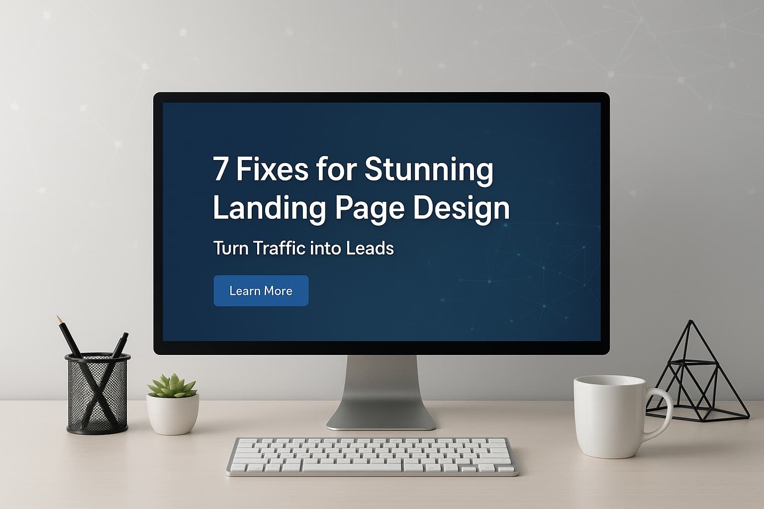
Stop hoping your visitors will figure it out. Start guiding them. We’re breaking down the seven non-negotiable elements you need to fix today to transform your landing page from a traffic drain into a lead machine.
1. The Laser-Focused Headline: Deliver the Instant Promise
Your headline is the first thing a visitor reads, and it’s arguably the most important element on the entire page. It’s the instant value proposition.
Think of it like this: When they click your ad, they have a question in their mind, which is: “What do I get here?” Your headline must answer this question in five seconds or less.
The Fix:
- Match the Source: The text on the headline of your landing page design must match the language of the ad, email, or social post that led them there. If your ad promised a “Free 7-Day Email Course,” the headline needs to say the exact same thing. This creates psychological cohesion and trust.
- Focus on the Benefit: Don’t just name the product. Tell them what problem it solves. Instead of “New Reporting Software,” try “Finally Get Clarity: Cut Reporting Time by 50%.”
2. Visual Hierarchy & White Space: The Guided Tour
Most bad landing pages suffer from “design chaos.” Everything screams for attention, which means nothing gets attention. The visitor’s eye doesn’t know where to land, so they leave.
A great landing page is a guided tour. Your design should physically lead the visitor’s eye straight to the form and the Call-to-Action (CTA) button.
The Fix:
- Embrace Negative Space: Use plenty of white space (or empty space) around your key elements. This doesn’t just look cleaner; it forces the eye to focus on the elements that are there, namely the headline and the CTA.
- Follow the Pattern: People naturally scan in an F-pattern (on content-heavy pages) or a Z-pattern (on simpler pages). Place your headline where the Z starts, your main image in the middle, and your CTA where the Z ends.
3. The Irresistible Offer/Value: The Quick ‘Why’
Once they’ve confirmed they’re in the right place, they need to know why they should give you their email address right now. This is where most pages fail—they list features instead of solving the customer’s pain.
The Fix:
- Bullet Points Matter: Long, dense paragraphs get skipped. Use short, punchy bullet points to highlight the core benefits.
- Bad: “Our solution includes integrated project management tools.”
- Good: “Stop Chasing Emails: Keep all client files and communication in one place.”
- Focus on Pain Relief: Every bullet point should tap into an emotional or professional frustration your ideal customer is currently facing and promise them relief.
4. Trust Signals: The Social Proof Layer
You are asking a stranger for their valuable contact information. Why should they trust you? Credibility is essential, especially when dealing with data privacy. Without it, the form is a dead end.
The Fix:
- Show, Don’t Tell: Integrate social proof near the form. This could be client logos (“Trusted by”), a quick star rating, or a snippet from a glowing testimonial.
- Real Faces, Real Quotes: A testimonial with a name, title, and a photo looks infinitely more real than an anonymous quote. Use actual language from happy customers; it builds confidence immediately.
- The Tiny Security Badge: If you’re asking for sensitive data, add a small security badge (like McAfee Secure or a basic SSL lock icon) near the form fields. It’s a small detail that reduces friction.
5. Above the Fold Clarity: The 3-Second Rule
“Above the fold” refers to the content visible on the screen before the user scrolls down. Since a visitor’s attention span is minimal—maybe three seconds—you must deliver the goods immediately.
The Fix:
- No Scrolling Required: The four core elements must be visible without scrolling, even on a small laptop screen:
- The Headline (What is this?)
- A Supporting Image/Video (What does it look like?)
- A Brief Summary of Benefits (Why should I care?)
- The CTA Button (What do I do next?)
- Ditch the Navigation Bar: This page has a singular focus. Do not include your main website navigation menu or footer links. They only offer escape routes for your visitor.
6. The Singular CTA: Stop Confusing Them
A high-converting landing page has one, and only one, goal. If you give the visitor too many options—”Download Now,” “Learn More,” “Visit Blog,”—you’ve confused them, and confusion is a conversion killer.
The Fix:
- One Goal: Decide what you want the visitor to do (e.g., download a guide, book a demo). Remove every other clickable link.
- Action-Oriented Button Text: Never use the generic “Submit.” That word is boring and sounds like work. Use compelling, active verbs that relate to the offer. Try: “Claim My Free Ebook,” “Start My Trial Now,” or “Get Instant Access.”
- Contrasting Color: The CTA button must stand out from the rest of the page. Use a color that contrasts sharply with the background and the surrounding text. It should practically jump off the screen.
7. Mobile-First Design: The Hidden Conversion Killer
Globally, the majority of web traffic now comes from mobile devices. If you designed your page on a desktop screen and didn’t thoroughly test it on a phone, you’ve likely killed half your conversions already.
The Fix:
- Test on a Real Phone: Don’t just resize the browser window; look at your page on an actual small screen. Are the form fields easy to tap? Is the text legible without zooming?
- Big Buttons: Make your CTA button large enough to be easily pressed by a thumb. You should never worry about a visitor accidentally tapping the wrong thing.
- Speed is Essential: Mobile users are less patient than desktop users. Use compressed images and minimal code. If your page takes more than three seconds to load, your visitor is gone.